All Works

McKinsey & Company Internship Design Project

Redesigning the website of a local spa to draw in new clientele

Timeline:
July 2021 - August 2021
My Role: 
Sole UI Designer
Team:
Sole Stewart, Alayo Oloko
Tools:
Figma
Skills:
Interaction Design, Visual Design, Design Systems

Timeline:

March 2023- September 2024

My Role:

Lead UX Designer

Team:

1 Designer, 2 Software Developers, 1 Database Administrator, 1 Product Manager

Tools:

Figma, Bootstrap, HTML/CSS, .NET, Microsoft Azure

Skills:

Interaction Design, Visual Design, Design Systems

PROJECT OVERVIEW

During my Technology Internship at McKinsey & Company, I took on my first UI design project: redesigning the website for Life Essential Massage, a local spa. The goal was to create a calming, user-friendly experience that made booking appointments easy and stress-free. Focusing on improving the visual hierarchy, information architecture, and accessibility, I developed high-fidelity wireframes and a serene color palette to enhance the site's usability. The redesign resulted in a cleaner, more organized interface, helping the business attract new clients and improve user satisfaction.

BACKGROUND

I chose Life Essential Massage LLC for this project because its focus on holistic, therapeutic services for women provided a perfect opportunity to explore how design can evoke a sense of calm and relaxation while making the booking process seamless for users.

WHAT'S the problem?

The current website for Life Essential Massage lacks a user-friendly design that does not effectively reflect the spa’s calming atmosphere.

The site struggles to create an inviting, serene experience that mirrors the spa’s focus on holistic and therapeutic care. Additionally, key features such as booking appointments and accessing information about services are not as intuitive or seamless as they should be, potentially leading to frustration for users. Without a more visually appealing and functional interface, the website risks losing potential clients who may find it difficult to navigate or connect with the brand’s soothing, customer-centered ethos.

The primary goal of this project is to redesign the website to create a more intuitive and visually calming user experience that aligns with the spa’s therapeutic offerings and simplifies the booking process.

RESEARCH

identifying key user challenges

The low contrast ratio decreases accessibility

On the Spa Menu page, the contrast between the background color and the body text is low. This makes the menu harder to read for users with visual impairments. This can be improved by making the background color lighter, or by changing the background color to a dark color and making its foreground text a light color.

The lack of visual hierarchy affects user flow

The current design needs more distinction between important and less important content. By manipulating the size of text and images, we can distinguish high priority content from lower priority content.

The information architecture lacks a logical structure

Schedule Appointment, About Us and Location are all placed next to each other at the bottom of the homepage. These are important areas of content that the user will need to locate and read in order to book an appointment. However, their current placement is not easy for users to visually find. By bringing these up to the navigation bar, users can complete these tasks more easily.

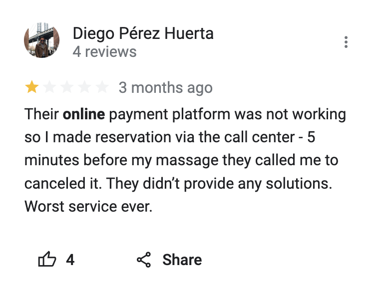
To better understand how to address these challenges, I analyzed ratings and reviews from a few other spa booking sites

examining Findings from User Reviews: Pain Points and Delights

Pain Points

- No support when errors occur on the website
- It's difficult to book appointments online
- A lack of quality customer service
- Misleading information on the site

Delights

- It's easy to book a service online
- The site content is very informative
- The website matches the spa's environment and identity

How might we create a seamless, intuitive online booking experience, provide better error support, improve customer service interactions, ensure accurate information, and enhance the website’s alignment with the spa’s relaxing environment to build trust and satisfaction for users?

Developing a Sitemap to Structure an Intuitive User Experience

How does this sitemap address what our users need?

It organizes key information—such as booking appointments, learning about services, and accessing contact details—into a clear and intuitive structure. It prioritizes essential tasks, such as scheduling and finding service information, by placing them in easily accessible areas like the main navigation. By improving the flow and reducing the number of steps needed to complete actions, the sitemap ensures that users can navigate the site quickly and effortlessly, addressing pain points like difficult navigation and hard-to-find information.

IDEATION

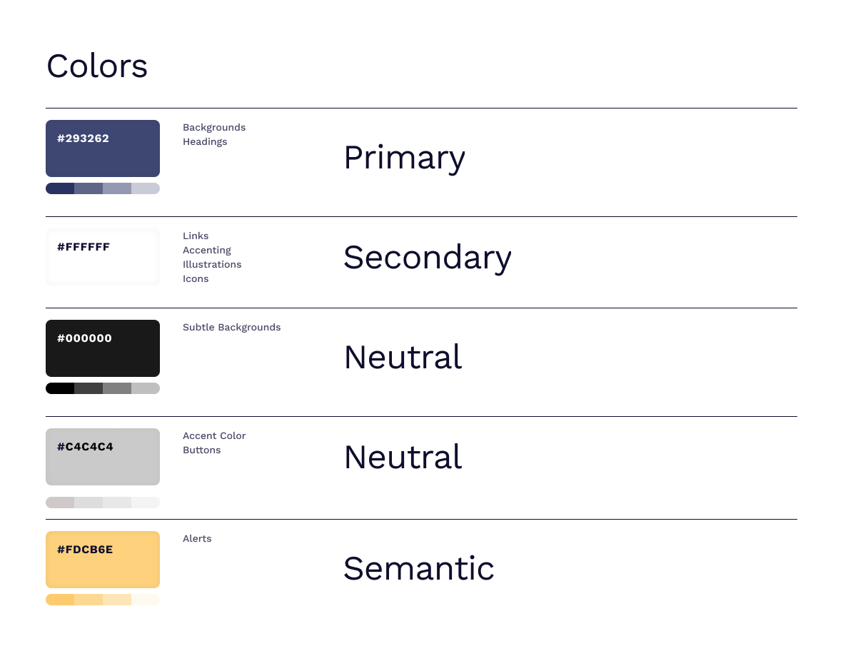
Building a consistent Design System Based on User Research Insights

Web Accessibility

According to Web Accessibility Guidelines, a color contrast ratio of 4.5:1 is the minimum ratio for text readability. We tested our color combinations on https://accessibleweb.com/color-contrast-checker/ to ensure that it is sufficient.

Creating and Refining Low-Fidelity Designs Through Team Feedback

Team Feedback & Critique

I reached out to colleagues on the Digital Design team to get their perspectives on the low-fidelity design. The received feedback included that the Book Now page should include a form that users can fill out to make an appointment.

DESIGN SOLUTION

As I Integrated Team Feedback and User Insights, the Final Design Was Refined to Address Core Challenges and Elevate the User Experience

IMPACT

Improved Booking Experience

The redesigned website simplified the appointment booking process, reducing user frustration and making it easier for clients to schedule services quickly and efficiently.

Enhanced Visual Appeal

The new design better reflected the spa’s calming atmosphere, using a soothing color palette and improved layout to create a more inviting experience that aligns with the spa’s identity.

Increased Accessibility

The site now follows accessibility best practices, including improved contrast ratios and clearer navigation, ensuring a more inclusive experience for all users, including those with visual impairments.

Higher User Engagement

By addressing key pain points and improving information architecture, the website saw an increase in user satisfaction, with essential information being more accessible and easier to navigate.

if i could go back in time, this is what i would've done differently

1. Expanded on Mobile Responsiveness

Why?
It would've ensured that the website performed seamlessly across all devices, particularly since many users book services on their phones.

2. Incorporated a more Robust Customer Support Feature

Why?
I would've implemented a live chat or a dedicated FAQ section, to address the common pain point of insufficient support when errors occur. These enhancements would have further improved both usability and customer satisfaction.